The trending colours for 2024 are all about creating a lovely and inviting home. Industry experts have made their picks for the new year, and the palette is full of rich and stimulating colours tinged with natural warmth. From classic neutrals to earth tones to vintage-inspired hues, the 2024 colour palette has the ability to envelop a room like a comforting embrace.
In this blog, we’ll put all eyes on the neutral colours experts say will take over the year. By definition, a neutral is a colour without much intensity or saturation. Neutral colours are muted shades that appear to lack colour but often have underlying hues that change with different lighting. Examples of neutral colours include beige, taupe, gray, cream, brown, black, and white. While they don’t appear on the colour wheel, neutral colours complement primary and secondary colours. Some even have a hue of one within them! Here are the top 5 neutral colours for 2024 (with some insight on the perfect Roman Shade to match):
1. Darkroom, Sherwin-Williams
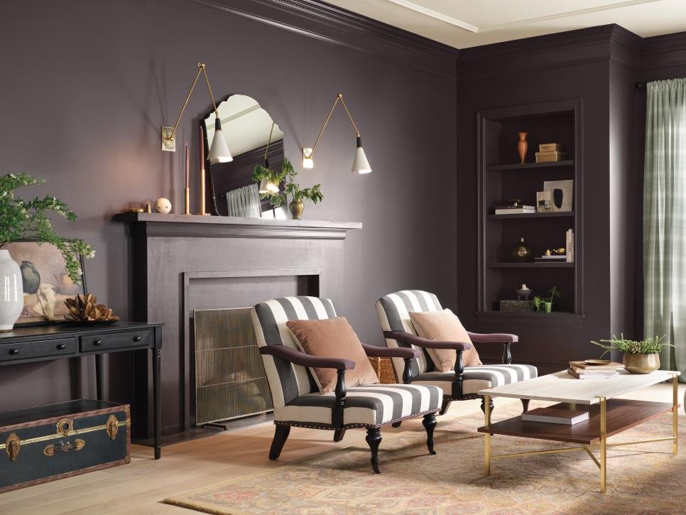
Darkroom is a rich black with eggplant undertones and is undoubtedly romantic, moody and elegant all at once. It was given the title of Colour of the Year in the HGTV Home by Sherwin-Williams collection.
How You Can Use It
The purple notes in this black paint mean it adds drama to almost any space in a soft, inviting way. In a living room, it elevates the design while maintaining a cozy and relaxed feel. Another plus: Since it’s a dark neutral, it accents almost any primary and secondary colour indoors or out!
2. Blank Canvas, Behr
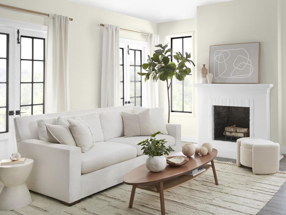
Blank Canvas by Behre is all about fresh starts and sanctuary-like spaces. This warm white transforms any room into its namesake: a clean slate ready for endless design possibilities. Warm white colours make a room appear larger, making them perfect for living areas or smaller bedrooms.
How To Use It
The versatility of the shade provides a clean, cozy, and warm essence to any space – complimentary to any design style. Like all of these colours (thanks to the versatility of neutrals!) you can pair a stylish window treatment to accentuate each one’s hues! For example, the clean slate that Blank Canvas exudes is a great way to introduce a bolder statement piece like a LOGANOVA® patterned Roman Shade.
3. Cool Beige, Sherwin-Williams
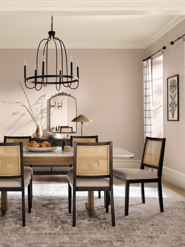
Cool Beige is a workhorse, as it blends beautifully with almost any colour including other neutrals. This contemporary taupe exudes classic comfort.
How You Can Use It
This paint colour is a winning choice for a formal space, like a dining room where it strikes the perfect balance between traditional elegance and relaxed style. This muted hue mixes well with vintage-inspired decors, like conventional rugs, and earthy elements like caning and natural fibres (visit LOGANOVA® to see our recommended pairing for this all-inclusive neutral.)
4. Tiramisu, C2 Paint
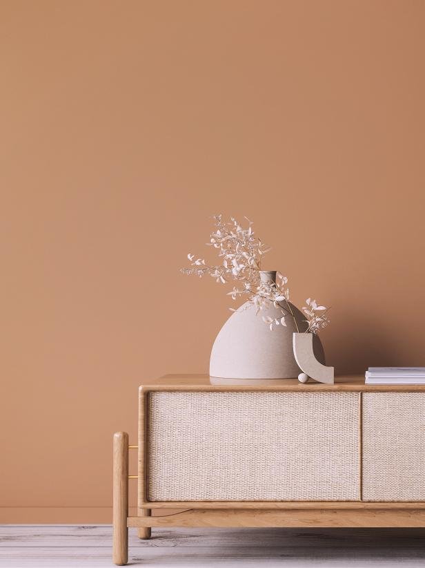
Just like we’re seeing in fashion, ’90s-style browns and neutrals are coming back in a major way in the design world. Tiramisu by C2 Paint plays off of this in an especially inviting way with warm, chocolatey undertones. It’s as decadent as it sounds!
How To Use It
Though it’s warmer and more saturated than your typical beige, Tiramisu is a toasty neutral that has endless possibilities around your home. Apply it on the walls to cover a room with coziness or try it on small accents, like a side table, if you just want to get a taste of the trend. A more saturated neutral can be complemented with a simple yet elegant plain shade.
5. Restrained Gold, Sherwin-Williams
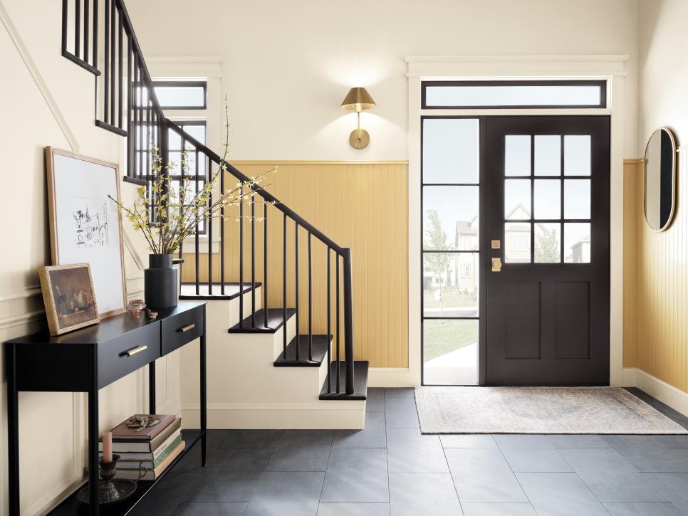
The golden hue of Restrained Gold takes its colour cues from Mother Nature. With this vintage-inspired colour, you can create a look that effortlessly balances modern style with tradition.
How You Can Use It
Colour psychologists would argue that Restrained Gold is the perfect backdrop to an activity-filled common area like a foyer, mudroom or family room. Colour psychologists credit all shades of yellow with sparking creativity, optimism and imagination, making this sunny shade a great choice for home offices and kids’ playrooms, too!
Bottom Line
Clean, elegant, romantic, earthy, warm and vintage hues are on the come up. The notion of expanded possibilities certainly comes through in the various 2024, with all of these colours being able to blend with and complement almost any colour and pattern. This year’s defining colour story? Whatever you choose to make it!
Recommended Posts:

